Friday, 2 October 2015

Double page spread developments/progress


This draft was to see if my image would work.


In this draft I kept the image but using the drawing tool, I added a paint effect and a rough edge.


Contents page developments/ progress


In this draft I changed the images to make sure they work with the style.


In this draft I made the story titles bold, increased the distance between the text and page numbers, and added an oval around the royal blood poster text to make it stand out more.


Front cover developments/progress


 This draft uses the white title to see if it would work with the image.

 This draft still uses the white title but with a black border to see if it would make it stand out more or not.


This draft uses the black title to see if it will work with the image.

 In this draft I used a dark background with a whiter border around the artist. The white title is also used.


This draft also uses the dark background but without the white border around the artist. I also lightened some of the text so it was more readable.


Image manipulation process


I recorded how I made a CD cover for my artist that is featuring on my double page spread, as there was going to be an image of their CD on the page and I couldn't use someone else's design. I used the drawing tool to draw around the image and to create the shade of the jumper and make the dark edges. I also used the fill tool to colour in key areas like the jumper and hair along with a newspaper image for the background. I also used Ariel font for the name and Javanese Text for the album title.


Final design of my CD cover


Swirl effect on final front cover

First I made a rectangle shape and coloured it.grey.
I then moved the layer down just above the main image
 I then went to Filter, Distort and Twirl where I moved the angle to the highest number.
 I then used the twirl effect a couple more times to make it swirl more.
 I then changed it to multiply and put the opacity down to 33%.
Lastly I added a layer mask and using a black coloured paint brush, removed the swirl on the artist so it was just in the background.


This was my swirl effect on my front cover.

Framing shots including and excluding elements as appropriate


Front cover images
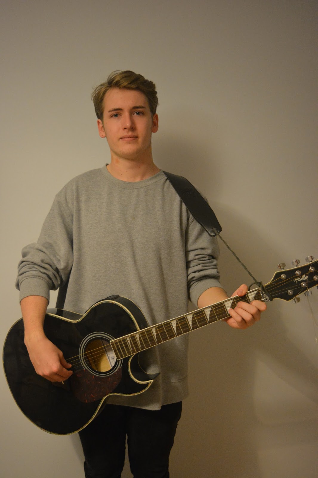
  • I chose to photograph my brother as he suited the style of my genre, with his style of clothing and being able to play the guitar. I photographed him against a plain background so to keep focus on him and make it easy to put writing over the top.


Edits
  • I decided to lighten the images as they were taken late at night so looked dark. I altered the tone of the image making the background the right colour, whilst editing the subject to keep the face warm in colour. Also in a few of the shots the t.v was in the way, so I used the clone stamp and blur tool to edit it out.


Gig photos
  • These photos were taken from the gigs I went to which I will try to include in my magazine. The quality in some photos isn't the best as they are quite blurry up close due to the image quality on my phone, but I will make sure that they are a small size so it's hard to notice and won't enhance the poor quality.


Google mock up ideas

I created these mock ups of my magazine by using images off the internet that will be similar in style to my own images. I did this so I could get an idea of how my magazine will look like and make sure that it actually worked and looked professional. I'm pleased with the overall outcome of my mock ups but on my cover I will adjust it further as I think it doesn't look as professional as I want it to be, and I'm not sure if it will look as good with my own imagery.

Front cover


contents page


double page spread