
Contents page

Double page spread


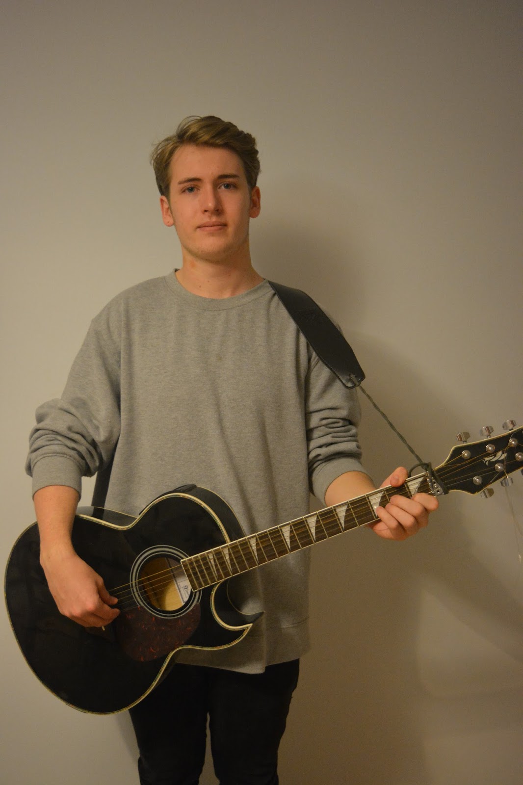
I created these mock ups of my magazine by using images off the internet that will be similar in style to my own images. I did this so I could get an idea of how my magazine will look like and make sure that it actually worked and looked professional. I'm pleased with the overall outcome of my mock ups but on my cover I will adjust it further as I think it doesn't look as professional as I want it to be, and I'm not sure if it will look as good with my own imagery.
Front cover  contents page  double page spread  |


 NME use columns to separate the text and make it easy to read so its not just a big block of text that looks boring.
Colour ideas   By trying out different colour ideas I have decided to predominantly use black and white within my magazine, along with red to make parts of it stand out. I have also decided to use grey or a blueish grey maybe for the backgrounds or boarders. By trying out different colour ideas I have decided to predominantly use black and white within my magazine, along with red to make parts of it stand out. I have also decided to use grey or a blueish grey maybe for the backgrounds or boarders.   Branding-logo design Typology Serif:

Sans Serif:

Block Serif:

Decorative:

Script:

Name ideas
I chose these names because they all link to my chosen genre, and I think they would work well as a title for a magazine. I decided to go with Encore as my title because that phrase is usually used often in rock gigs when the audience want the band to play another song. I also thought that the meaning of encore could relate to my magazine with the idea that my audience would want more of my magazine, like they would want more music from a band.
Cover stories and feature stories
|


